Do you have strong reasons for what you're saying? I would like to start by explaining the main causes that throughout the years developing for iOS led me to this conclusion.
In the beginning (and I'm talking almost Jurassic iOS mobile development back when I first started developing for iPhones), we were working with two OS versions at the same time, migrating from iOS 4.2 to 5.1, the second generation of iPads and the iPhone 4S flagship models were being released. At this point the Drag and Drop kind of UI development available on XCode's Interface Builder was easy and fast, and very reliable because all the hardware models until then used the same screen ratio and resolution. So the iPhone 4S had retina capabilities, but nonetheless this was just a matter of introducing a new resource/asset size... the "@2x".
Time passed and more iPhone models and iOS versions were released. Suddenly iPhone 5 brings a strange new large screen and the screen ratios and resolutions start to suffer from fragmentation (this kind of phenomenon was present in Android since the beginning of the OS) and unlike Google's approach to solve the problem with relative layouts and auto-adjusting view sizes, Apple's absolute View positioning and sizing was outdated and it simply didn't work anymore.
So the new models and screens started to create a problem that most likely will continue to escalate as more and more models and screen sizes/ratios come out. (Don't forget, nowadays we have "@3x" assets/resource sizes and sometimes also the need to introduce some iPhone-6 screen size hacks to make sure the layouts behave correctly on all phone sizes and OS versions)
The release of iOS 6 came with a new way of positioning views that would allow the developers to create apps for all screen sizes without having to create the views by hand, sizing them in code with somewhat complicated formulas to calculate sizes and placement. Apple introduces AutoLayout a constraint based layout engine and adapts the Interface Builder's system to support the new layout system as well as the old absolute positioning model.
This is when things started to become shady to say the least. Interface Builder implements the AutoLayout system by creating relations between views and assign constraint values that control position, size, placement. All this is done through "ctrl+click and drag" which is very error prone, because sometimes the action area for the drag and drop is very small and narrow, and is very likely to miss the target and create a relation with some other view, causing the layout to break and the app to crash. Also there's another small detail, sometimes with just one click and drag, you will be applying more than one constraint to the views. I just couldn't stop wondering about all this black magic being made behind the scenes.

Another of my main problems while developing for iOS using xib files or Storyboards is version control. The problem here is not that these files can't be under source control, rather than that, I'm complaining about Xcode as a development tool itself. XCode and Interface Builder are very metadata driven, which means they generate and depend a lot on the metadata created for the project. Each time you touch (even if it is just to see something, read-only purposes) automatically XCode will generate some new metadata and change the file. If you work alone developing the app from top to bottom, this won't be a problem to you, but if you are a part of a team, this will eventually cause a lot of headaches and a lot of time wasted merging your project's branches.
So You are saying I should do it all in code?
Well the answer to that question is YES and NO... Let me explain:
You can do all the AutoLayout constraining in code, but if you enjoy your sanity I really don't recommend it. I do recommend you to get some insight and learn something about NSAutoLayout Constraints and how they work. Maybe do some little experiments with some simple layout needs and get to know them, how and when to use them.

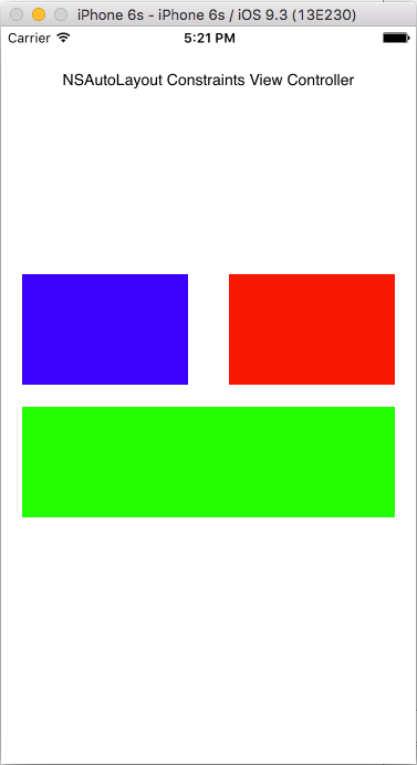
Looking at the image above, we can see that this layout is fairly simple and shouldn't be very hard to create using code. We only want to get to know how things are done and compare the results.
View placement: Bottom Green View has:
- width of 90% of the screen width -
widthConstraint3 - fixed height of 100pt -
heightConstraint3 - view center matching the horizontal center of the screen -
horizontalConstraint3 - top matching the vertical center of the screen with 10pt offset -
verticalConstraint3
Top Right Red View has:
- width of 40% of the screen width -
widthConstraint - fixed height of 100pt -
heightConstraint - right margin matching bottom green view right margin -
horizontalConstraint - bottom matching the vertical center of the screen with 10pt offset -
verticalConstraint
Top Left Blue View has:
- width of 40% of the screen width -
widthConstraint2 - fixed height of 100pt -
heightConstraint2 - left margin matching bottom green view left margin -
horizontalConstraint2 - bottom matching the vertical center of the screen with 10pt offset -
verticalConstraint2
NSAutoLayout Constraints
func setupViewLayout() {
  let viewHeights = CGFloat(100.0);
  let viewOffset = CGFloat(10.0);

  let bottomView = UIView()
  bottomView.backgroundColor = UIColor.greenColor()
  bottomView.translatesAutoresizingMaskIntoConstraints = false
  view.addSubview(bottomView)

  let widthConstraint3 = NSLayoutConstraint(item: bottomView, attribute: NSLayoutAttribute.Width, relatedBy: NSLayoutRelation.Equal, toItem: view, attribute: NSLayoutAttribute.Width, multiplier: 0.9, constant: 0)
  view.addConstraint(widthConstraint3)

  let heightConstraint3 = NSLayoutConstraint(item: bottomView, attribute: NSLayoutAttribute.Height, relatedBy: NSLayoutRelation.Equal, toItem: nil, attribute: NSLayoutAttribute.NotAnAttribute, multiplier: 1, constant: viewHeights)
  view.addConstraint(heightConstraint3)

  let horizontalConstraint3 = NSLayoutConstraint(item: bottomView, attribute: NSLayoutAttribute.CenterX, relatedBy: NSLayoutRelation.Equal, toItem: view, attribute: NSLayoutAttribute.CenterX, multiplier: 1, constant: 0)
  view.addConstraint(horizontalConstraint3)

  let verticalConstraint3 = NSLayoutConstraint(item: bottomView, attribute: NSLayoutAttribute.Top, relatedBy: NSLayoutRelation.Equal, toItem: view, attribute: NSLayoutAttribute.CenterY, multiplier: 1, constant: viewOffset)
  view.addConstraint(verticalConstraint3)

  let topRightView = UIView()
  topRightView.backgroundColor = UIColor.redColor()
  topRightView.translatesAutoresizingMaskIntoConstraints = false
  view.addSubview(topRightView)

  let horizontalConstraint = NSLayoutConstraint(item: topRightView, attribute: NSLayoutAttribute.RightMargin, relatedBy: NSLayoutRelation.Equal, toItem: bottomView, attribute: NSLayoutAttribute.RightMargin, multiplier: 1, constant: 0)
  view.addConstraint(horizontalConstraint)

  let verticalConstraint = NSLayoutConstraint(item: topRightView, attribute: NSLayoutAttribute.Bottom, relatedBy: NSLayoutRelation.Equal, toItem: view, attribute: NSLayoutAttribute.CenterY, multiplier: 1, constant: -viewOffset)
  view.addConstraint(verticalConstraint)

  let widthConstraint = NSLayoutConstraint(item: topRightView, attribute: NSLayoutAttribute.Width, relatedBy: NSLayoutRelation.Equal, toItem: view, attribute: NSLayoutAttribute.Width, multiplier: 0.4, constant: 0)
  view.addConstraint(widthConstraint)

  let heightConstraint = NSLayoutConstraint(item: topRightView, attribute: NSLayoutAttribute.Height, relatedBy: NSLayoutRelation.Equal, toItem: nil, attribute: NSLayoutAttribute.NotAnAttribute, multiplier: 1, constant: viewHeights)
  view.addConstraint(heightConstraint)

  let topLeftView = UIView()
  topLeftView.backgroundColor = UIColor.blueColor()
  topLeftView.translatesAutoresizingMaskIntoConstraints = false
  view.addSubview(topLeftView)

  let horizontalConstraint2 = NSLayoutConstraint(item: topLeftView, attribute: NSLayoutAttribute.LeftMargin, relatedBy: NSLayoutRelation.Equal, toItem: bottomView, attribute: NSLayoutAttribute.LeftMargin, multiplier: 1, constant: 0)
  view.addConstraint(horizontalConstraint2)

  let verticalConstraint2 = NSLayoutConstraint(item: topLeftView, attribute: NSLayoutAttribute.Bottom, relatedBy: NSLayoutRelation.Equal, toItem: view, attribute: NSLayoutAttribute.CenterY, multiplier: 1, constant: -viewOffset)
  view.addConstraint(verticalConstraint2)

  let widthConstraint2 = NSLayoutConstraint(item: topLeftView, attribute: NSLayoutAttribute.Width, relatedBy: NSLayoutRelation.Equal, toItem: view, attribute: NSLayoutAttribute.Width, multiplier: 0.4, constant: 0)
  view.addConstraint(widthConstraint2)

  let heightConstraint2 = NSLayoutConstraint(item: topLeftView, attribute: NSLayoutAttribute.Height, relatedBy: NSLayoutRelation.Equal, toItem: nil, attribute: NSLayoutAttribute.NotAnAttribute, multiplier: 1, constant: viewHeights)
  view.addConstraint(heightConstraint2)
}
As I was saying, it shouldn't be difficult to get the layout to work, but it is surely painful to look at the code, as well as writing it... (It's not my brightest code example, but this is only a sample and I tried to keep it as simple as possible)
But wait, I'm not saying you should do all this work, because there are people who already went through the same pain you are experiencing and developed some great tools and libraries to help making it all easier on you. I'll just refer and give examples of two of them because I have tried it and at some point used them myself. Bear in mind that there are probably many more. You'll have to do some research and decide which one suits you better, regarding your coding style and layout needs. Here's a small list of some AutoLayout Domain Specific Language (DSL) libraries that Chris Dzombak compiled to help you get started.
I have used PureLayout and SnapKit and both do the same just fine! Let's take the example above and see what we need to do to accomplish the same result.
PureLayout
func setupViewLayout() {
  if (!didSetupConstraints) {
    bottomContainer = UIView.newAutoLayoutView();
    self.view.addSubview(bottomContainer)

    bottomView = UIView.newAutoLayoutView();
    bottomView.backgroundColor = UIColor.greenColor()
    self.bottomContainer.addSubview(bottomView)

    topRightView = UIView.newAutoLayoutView();
    topRightView.backgroundColor = UIColor.redColor()
    self.view.addSubview(topRightView)

    topLeftView = UIView.newAutoLayoutView();
    topLeftView.backgroundColor = UIColor.blueColor()
    self.view.addSubview(topLeftView)
  }
  self.view.setNeedsUpdateConstraints(); // bootstrap Auto Layout
}

override func updateViewConstraints() {
  let viewHeights = CGFloat(100.0);
  let viewOffset = CGFloat(10.0);

  if (!didSetupConstraints) {
    //extra view to help setup the layout
    bottomContainer.autoMatchDimension(.Height, toDimension: .Height, ofView: self.view, withMultiplier: 0.5);
    bottomContainer.autoPinEdgeToSuperviewEdge(.Leading);
    bottomContainer.autoPinEdgeToSuperviewEdge(.Trailing);
    bottomContainer.autoPinEdgeToSuperviewEdge(.Bottom);

    bottomView.autoSetDimension(.Height, toSize: viewHeights); //heightConstraint3
    bottomView.autoMatchDimension(.Width, toDimension: .Width, ofView: self.bottomContainer, withMultiplier: 0.9); //widthConstraint3
    bottomView.autoAlignAxisToSuperviewMarginAxis(.Vertical); //horizontalConstraint3
    bottomView.autoPinEdgeToSuperviewEdge(.Top, withInset: viewOffset); //verticalConstraint3 - using container view to help

    topRightView.autoSetDimension(.Height, toSize: viewHeights); //heightConstraint
    topRightView.autoMatchDimension(.Width, toDimension: .Width, ofView: self.view, withMultiplier: 0.4); //widthConstraint
    topRightView.autoConstrainAttribute(.Right, toAttribute: .Right, ofView: self.bottomView); //horizontalConstraint
    topRightView.autoPinEdge(.Bottom, toEdge: .Top, ofView: self.bottomContainer, withOffset: -viewOffset); //verticalConstraint

    topLeftView.autoSetDimension(.Height, toSize: viewHeights); //heightConstraint2
    topLeftView.autoMatchDimension(.Width, toDimension: .Width, ofView: self.view, withMultiplier: 0.4); //widthConstraint2
    topLeftView.autoConstrainAttribute(.Left, toAttribute: .Left, ofView: self.bottomView); //horizontalConstraint2
    topLeftView.autoPinEdge(.Bottom, toEdge: .Top, ofView: self.bottomContainer, withOffset: -viewOffset); //verticalConstraint2

    didSetupConstraints = true;
  }
  super.updateViewConstraints()
}
The PureLayout version doesn't bring down the number of necessary lines of code very much, but it becomes a little more clear to read and the code seems a little less messy. Now we can see some methods being called that actually express something we can relate to how the view is going to behave in terms of sizing and placement. But we do have a downside with this approach, we have our code separated in two methods. The first will instantiate the views and the latter will do the placing and sizing. As a downside, we did need to add an extra view to help us with positioning the views, but it is only a container to help to achieve view relative positioning. Also we can't forget to bootstrap the layout engine otherwise nothing will happen.
SnapKit
func setupViewLayout() {
  let viewHeights = CGFloat(100.0);
  let viewOffset = CGFloat(10.0);

  self.view.addSubview(self.bottomContainer);
  self.bottomContainer.snp_makeConstraints { make in
  make.height.equalTo(self.view).multipliedBy(0.5)
  make.width.equalTo(self.view)
  make.centerX.equalTo(self.view)
  make.bottom.equalTo(self.view);
  }

  bottomView.backgroundColor = UIColor.greenColor()
  self.bottomContainer.addSubview(self.bottomView);
  self.bottomView.snp_makeConstraints { make in
  make.height.equalTo(viewHeights) //heightConstraint3
  make.width.equalTo(self.view).multipliedBy(0.9) //widthConstraint3
  make.centerX.equalTo(self.view) //horizontalConstraint3
  make.top.equalTo(self.bottomContainer).offset(viewOffset)//verticalConstraint3 - using container view to help
  }

  topRightView.backgroundColor = UIColor.redColor()
  self.view.addSubview(self.topRightView)
  self.topRightView.snp_makeConstraints { make in
  make.height.equalTo(viewHeights) //heightConstraint
  make.width.equalTo(self.view).multipliedBy(0.4) //widthConstraint
  make.right.equalTo(self.bottomView.snp_right) //horizontalConstraint
  make.bottom.equalTo(self.bottomContainer.snp_top).inset(-viewOffset) //verticalConstraint
  }

  topLeftView.backgroundColor = UIColor.blueColor()
  self.view.addSubview(self.topLeftView)
  self.topLeftView.snp_makeConstraints { make in
  make.height.equalTo(viewHeights) //heightConstraint2
  make.width.equalTo(self.view).multipliedBy(0.4) //widthConstraint2
  make.left.equalTo(self.bottomView.snp_left) //horizontalConstraint2
  make.bottom.equalTo(self.bottomContainer.snp_top).inset(-viewOffset) //verticalConstraint2
  }

  self.view.setNeedsUpdateConstraints(); // bootstrap Auto Layout
}
The SnapKit version of the code is probably my favourite. To setup the constraints we access some of the views properties and assign them values either by relation to other views, or absolute values. In any case, the code syntax is very self explanatory and very easy to read. Unlike the PureLayout, we can have code instantiating the views and positioning/sizing them all in the same place, but we will need to bootstrap the layout engine just the same. One of the advantages over PureLayout is that we won't need to remember that we have to put the layout code exactly in the updateViewConstraints method or in the layoutSubviews (in case you are subclassing views with custom behaviour and UI) for things to work.
As you can see from the examples above, you still do all your layout setup through code, but the number of lines written is probably smaller than with the usage of NSAutoLayout Constraints and the readability is much greater using the DSL for Autolayout approach.
As a side note, you can also use something called Visual Format Language to layout your views that allows you to write your layout using an ASCII-art formatted string, witch works fine for some of the UI positioning needs, but you can't have relative sizing and positioning relations between views which makes it less versatile. You will most certainly have to use it along with NSAutoLayout Constraints. Also it has a special format grammar that you will have to master in order to achieve the same results as using just layout constraints.
TL;DR
Before getting to the point: I do think Interface Builder is a very powerful and helpful development tool. It allows developers to quick and easily start developing beautiful UI and User Experience without even starting to code anything. Also, it allows designers and other non-developers to be involved and able to do some of the UI work without much technical knowledge.
Creating your UI experience through code is not the easiest job, but with enough practice and experience you'll probably be ending up writing your layouts in code faster than clicking and dragging stuff on Interface Builder and then adjusting the constraints by hand. You'll have more control over what happens on the device's screen, manually controlling how views place themselves and adjust to different screen sizes. Also, you'll have to keep in mind all the possible merge conflicts and other multi-member team issues that arise when going through the Interface builder approach.
In the end, it's not all about how you build your layouts that matter, what's important is that you explore and understand how things are done in different ways, and just go with the one that suits your needs. You will be able to make an informed decision and be able to support your reasons for doing so.


