There is a very common feeling among Software Engineers: the feeling of being able to create a tool that can actually cause some impact in our lives, in our society, even in the whole world!
When we start our professional career, we expect to start developing mind-blowing software that could change the way our society works. We also expect our code to be flawless. We expect that the data model and controller we just developed from scratch without taking our fingers off the keyboard will work like a charm on the first try. But then, we are faced with reality: there is still a big road ahead of us and we still have a lot to learn from the people around us before we can actually "change the world". Basically, our expectations are really far away from actual reality. And that could make us sad. So we go around that and learn how to manage our expectations: we find ways to make sure our expectations are closer to reality. We start considering past experiences and patterns, our own abilities and limitations, and we adapt. How could that work on improving our software solutions and development processes?
The goal
Let's say we are responsible for the development and maintenance of a really important resource management system in our company, which holds many session records in our database created whenever a specific resource is in use. How great would it be if we could use those records to build and integrate into our software a model capable of predicting the availability of a specific resource? That was the challenge! Having already a prototype in its early stages, we embraced the project and started developing together a much more reliable and robust solution in terms of data analysis and processing, and we also made it appealing in the presentation of such data. Then, using all the knowledge gathered, we built a module to do the predictions automatically. And finally, we imported the data and represented the results in a beautiful diagram accessible from our software. Simply said, simply done... or not.
The data
When we start gathering and processing data, we always imagine that the data will be clean and tidy. But, the truth is: if human behavior was involved in the process, it won't be clean and tidy, and that was the case. We could find all kinds of strange things in our database, such as different users sharing the same resource at the same time. Fortunately, those strange cases are rare and this adds a small amount of uncertainty to our predictions. After spending a lot of time understanding the dubious details of the data we finally got the data clean and tidy!
The key to a predicting model is to understand which features should be analyzed and how. This starts by postulating all variables we want to analyze. Of course we would dream about a very complicated model that can address different variables, understand correlations between seemingly uncorrelated data and predict accordingly. Better to start with a simpler model, and iterate from it. And simplicity says: it depends on time and space.
The analysis
Understanding patterns and trends can be a funny thing to do. You start exploring data, trying your hypothesis, drawing plots and time flows. Sometimes data is nice to you, showing its secrets easily, such as similar patterns that repeat from Monday to Friday, which simplifies our job.
But, patterns are often fuzzy:

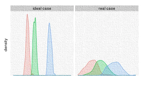
In this plot we can see histograms of the number of resource requests for different moments of the day. On the left, there is an ideal situation where the picks are sharp and distinguishable. On the right, there is a real situation where the picks are smoother. That means our prediction is associated with a not-so-small error bar. We have studied statistics, and we know that error bars are to be expected. Nevertheless, it's always complicated to explain this to someone else.
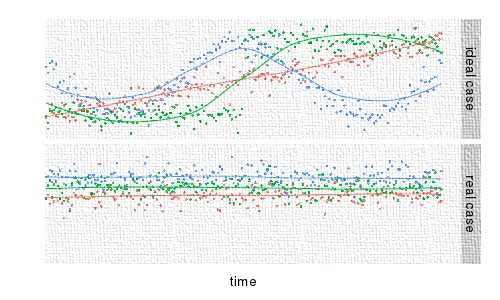
Sometimes, we search for non-existing patterns. We could guess that the resource availability can vary with time, together with some noise. Something like:

On this plot we see resource availability over time. At the top we present three different behaviors, where we can easily spot a trend. At the bottom we present a real plot from our analysis, showing us a noisy reality. The solution is simple, but very difficult for the ego: abandon this postulate.
Anyway, at the end of this analysis we had enough information to rebuild the prototype. And, even if there was some uncertainty, thanks to statistics we could get meaningful predictions. Of course we would prefer to have precise predictions. Just try to explain to your soaking wet friend that even though the weather forecast said it would not rain with 90% probability, the fact of her wetness simply meant she was part of that unlucky 10%.
Presentation
Using the statistical model developed, we could now predict whether some specific resource might or might not be available at a certain time. The goal now would be to find an effective way to represent the data. We have big plans for this feature we are developing as part of our software and as it could eventually be seen and used by a large number of people. It's critical that we present the data in a clear way. The integration of the model should obviously be made without flaws, and that meant we had to start by adapting our solutions on both ends: the model and our software. The reality of building trusty software is not that simple!
However, the topic that was most discussed was the scale in which we would represent the data. We reached a point when we had a very nice diagram representing different types of resources with three different colors according to their availability. It is most natural that our expectations were to have a simple scale from 0 to 100 that could represent the whole spectrum of the statistical model's outcomes. But, again, reality is not that simple and it turned out that during the whole day we had values between 80 and 100 percent for all our resources. We still have some work to do. This project is essentially a team effort and before meeting (or even exceeding the expectations of our targets) which is our main goal, it is very important to try and have control over the "final" result we achieve as a team, which implies that we have to manage each other's expectations.
We still have the goal of combining the occupation rate of related resource types and increase the overall awareness of the user of resource availability across the entire system, thus increasing the utility of the solution developed. Even though we are not entirely satisfied about the results, we can definitely aim for the best we can accomplish with our tools. Our feature is currently available to everyone, which we think to be a very positive thing: we achieved the goal we agreed on. But the question regarding the accuracy of the data represented still remains, and we are still gathering feedback that could validate our results. Of course we will never have an exact representation of reality, but the closer the results are to reality, the more satisfied we, our developers, and mainly our users will be.


